I’ve been learning about writing systems. Most languages today flow either left-to-right (like English) or right-to-left (like Arabic), always moving down the page. But Traditional Mongolian script? It’s a total outlier – you read it in vertical columns, moving from left to right across the page. Pretty unique, right?
I got curious about where you might actually see this script being used online today. My first stop was Wikipedia’s Mongolian version, but turns out they use Cyrillic instead. After digging around though, I found something cool – there’s a newspaper called “Khumuun Bichig” that still publishes in traditional Mongolian script. It’s actually the only one that does!
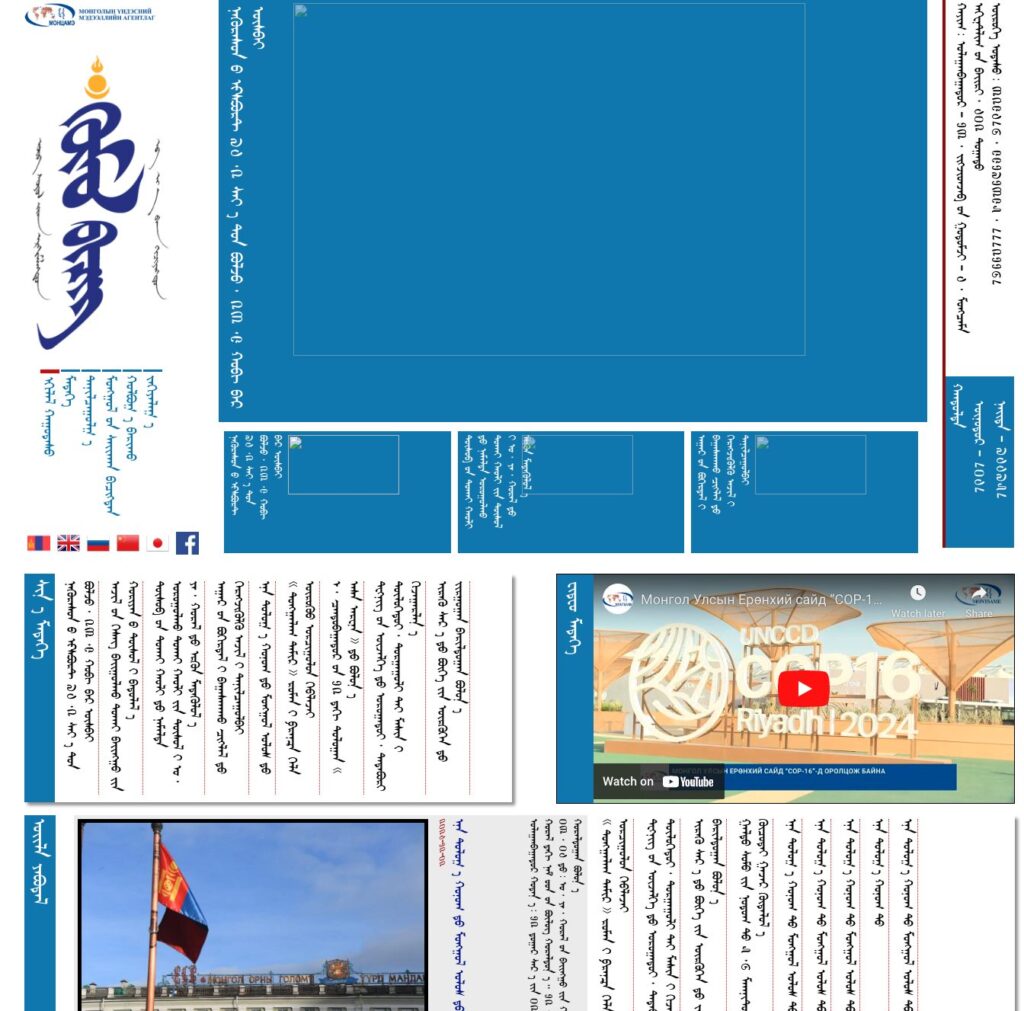
In this post, we will see how the developers of Khumuun Bichig have achieved this.
Why Writing Directions Differ
Language directionality evolved from writing tools and human handedness. Left-to-right scripts like Latin developed for ink on paper to prevent smudging by right-handed writers. Right-to-left scripts like Arabic emerged from stone carving, where holding the tablet in the left hand maintained visibility. Vertical scripts like Traditional Mongol, Chinese, and Japanese arose from scroll use, as top-to-bottom writing facilitated scroll handling, but unlike vertical Chinese or Japanese (which move Right-to-Left), Mongolian moves Left-to-Right, making it truly unique.
Implementing Mongol script in a website
Modern web browsers are built for horizontal text. To get around this, the developers of Khumuun Bichig didn’t wait for “proper” vertical support (like the writing-mode CSS property). If you inspect the code of Khumuun Bichig, you won’t even find a simple rotate(-90deg). Instead, the developers use a high-level mathematical “hack” to bend the browser to their will.
The “Garbled” Character Set
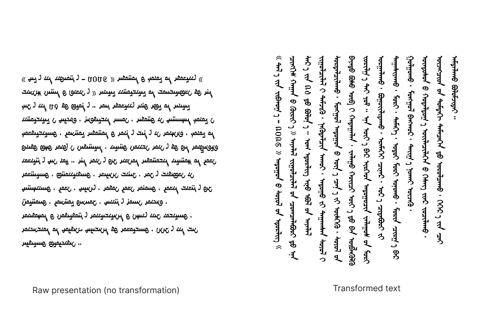
If you look at the HTML of the site, you won’t see Mongolian characters. You’ll see strings of Latin letters like: fkule& HegodesO MedekEt.
This is called Glyph Mapping. Because early Unicode standards for Mongolian were buggy or unsupported in browsers, developers “borrowed” the slots for Latin letters (A, B, C…) and replaced them with Mongolian shapes in a custom font. The computer thinks it’s typing “f”, but the screen shows a Mongolian glyph.
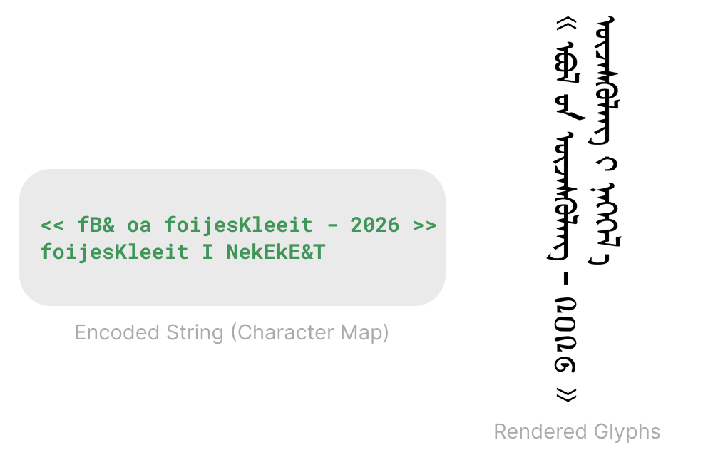
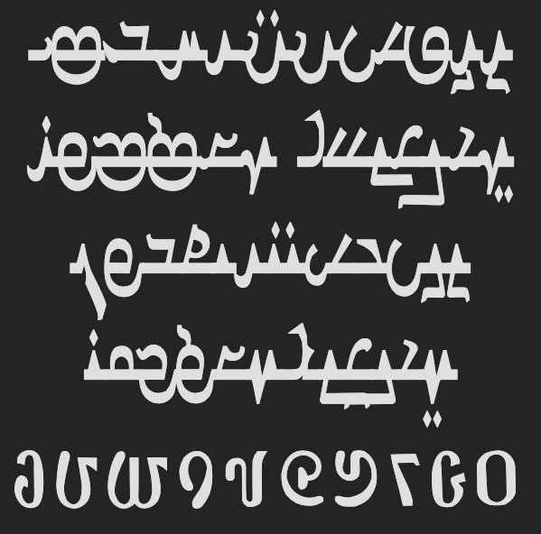
The Sideways Font Strategy
Since the developers don’t use writing-mode, how is the text vertical?
The font file acts as the “translator.” It takes that garbled input and displays the Rendered Glyphs. But there is a twist: in this specific font, every letter is physically drawn lying on its side (rotated 90 degrees clockwise).
This is what the actual font looks like:
The Secret Sauce: The Matrix Transformation
This is where it gets incredibly clever. If you simply type “sideways” letters, they would flow left-to-right, but the lines would stack top-to-bottom. Mongolian needs the columns to progress left-to-right.
If you just rotated a paragraph 90 degrees, the lines would stack from right-to-left (like Chinese) or bottom-to-top, which is wrong for Mongolian. The Matrix hack is necessary because it fundamentally redefines how the browser calculates “next line” and “next letter.
The developers apply this specific CSS rule to their content:
transform: matrix(0, 1, 1, 0, 0, 0);
transform-origin: 0px 0px;
This isn’t just a rotation. In linear algebra, the matrix represents a reflection across the y = x axis.
- The Result: It swaps the X and Y axes.
- What was supposed to be a horizontal line (X-axis) becomes a vertical column (Y-axis).
- What was supposed to be the downward stack of lines (Y-axis) becomes the rightward progression of columns (X-axis).
It is a mathematical masterclass in making a horizontal medium (the web) display a vertical culture.
Engineering Around the Default
The implementation on Khumuun Bichig is a reminder that the “standard” way isn’t the only way—it’s just the one the tools were built for.
Most developers would have looked at the horizontal limitations of CSS in the early 2000s and given up, or just used static images for every paragraph. Instead, the team behind this site used a “sideways” font and a 2×2 reflection matrix to force the browser to handle a coordinate system it wasn’t designed for.
It’s an ugly, brilliant hack that works. In a digital world that defaults to horizontal uniformity, Khumuun Bichig manages to stay vertical by sheer mathematical force.
Leave a Reply